We are incredibly intrigued with the design (especially all the concept work) that Moving Brands has created for Wikipedia. It truly is fascinating and gloriously minimal at the same time which you’d almost expect from Wikipedia. Our guess is that they didn’t go for it as nothing has changed.

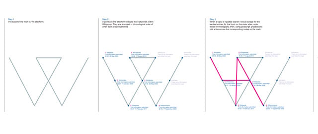
Moving Brands created a mark that leveraged the ownability of “W.” The mark is created from five lines that reference the “5 pillars,” and also represents the nine sister sites with nine equidistant nodes.

As the seventh most used site in the world, it was important that changes to the user experience would not alienate existing users of Wikipedia. Recommended changes focused on expediting navigation, encouraging editing with simplified functionality, and raising the profile of Wikipedia’s sister sites. The new look reflects the new identity and does not detract from the content on the site but rather works in harmony with it.


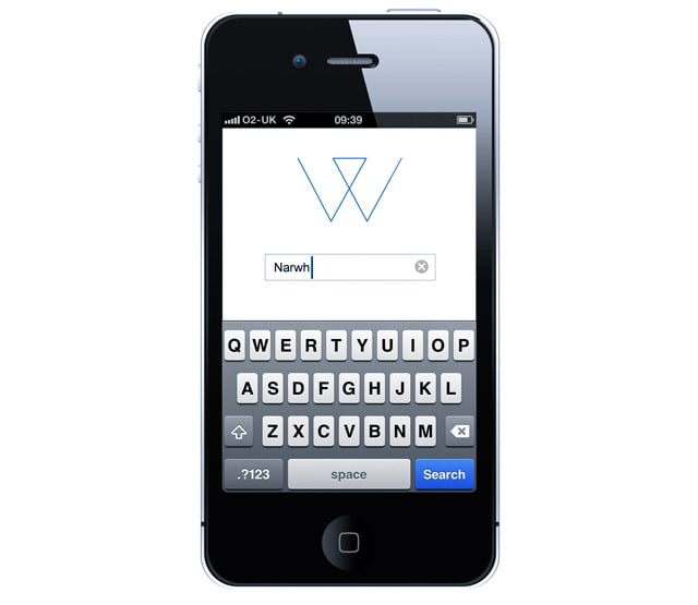
The pioneering vision of Wikipedia is at odds with their recent lack of innovation – particularly across mobile platforms. For an increasingly connected, knowledge-hungry market, we proposed a Wikipedia app with various search functionality, on top of the basic browser based search term input.


