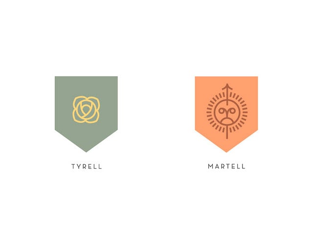
Darrin Crescenz, Senior Designer for Nike Brand Design has recently become obsessed (much like us and the rest of the world) with the Game of Thrones. And aren’t we lucky he did. While still watching the first series Darrin quickly sought out the first novel to get stuck into that too. Completely absorbed in George R.R. Martin’s fantasy series notes were made and sketches too which brings us to where we are today with a complete minimal redesign of all of the houses of Westeros. Damn they are cool. The posters themselves were selling for around $35 but unsurprisingly they are currently sold out. Bummer.

I began reading the first novel while watching the first season, quickly becoming hopelessly obsessed. I basically disappeared for about five months, devouring all five books in the series, culminating in this borderline-depression when there were no more books to read


Lannister’s use of crimson and gold, for example, sets that family apart from the rest on a purely visual level. But they also serve to give a vague indication of the values and psychology of the wearer. That same crimson and gold alludes to power and wealth and vitality, and when combined with the symbol of a rearing lion, tells a holistic story about the prominence of that family and their importance within the narrative

Conversely, the white and grey of House Stark is a straightforward representation of them–stoic, bleak, rather depressing. House Bolton’s pink and red ‘flayed man’ sigil pretty much screams psychopath.


