Josh Nychuk designed this range of business stationery as a means of self-promotion.
Featuring a business card, brochure, envelope and letterhead, he developed the range with an eye for optical illusion by using different print production techniques and laser cutting to invite curiosity and communicate hidden meaning.
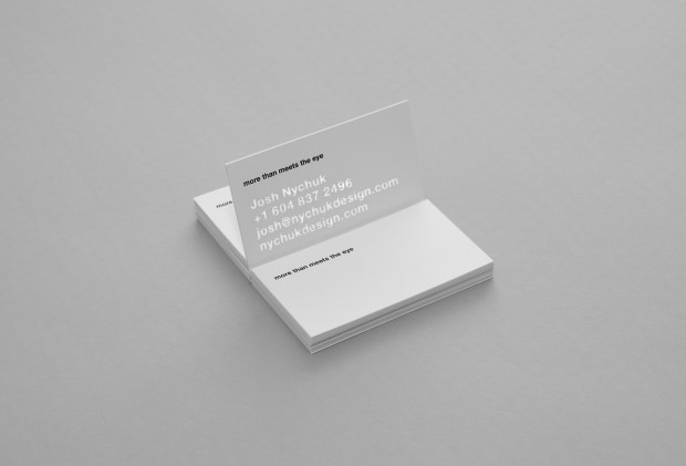
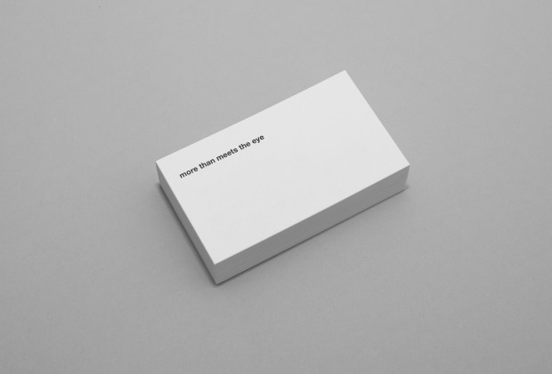
The identity communicates personal values, and my services in graphic design and photography through various techniques and production methods.The business card makes use of a production method in which a middle layer containing my contact information is laser cut out and sandwiched between two outer sheets of paper.

Facing downward you can only see the printed idiom “more than meets the eye” implying a hidden message or beyond what is initially perceived. When held up to a light source (daylight works fine) the contact information is revealed. A testament to minimalism, and a curiosity for what lies beneath the surface.

The symbol of the eye, is created through a reprographic technique called halftone. As the scale or depth-of-field changes the eye comes in and out of focus. It is accompanied by the Gestalt idiom “see the forest for the trees”.

The concept of Gestalt—a collection of symbolic entities that create a unified being or whole—seemed appropriate way communicate my specialization as a designer of visual identities in an enigmatic way. The identity does no make use of a formalistic logo, and instead is largely recognized through typography and technique.”