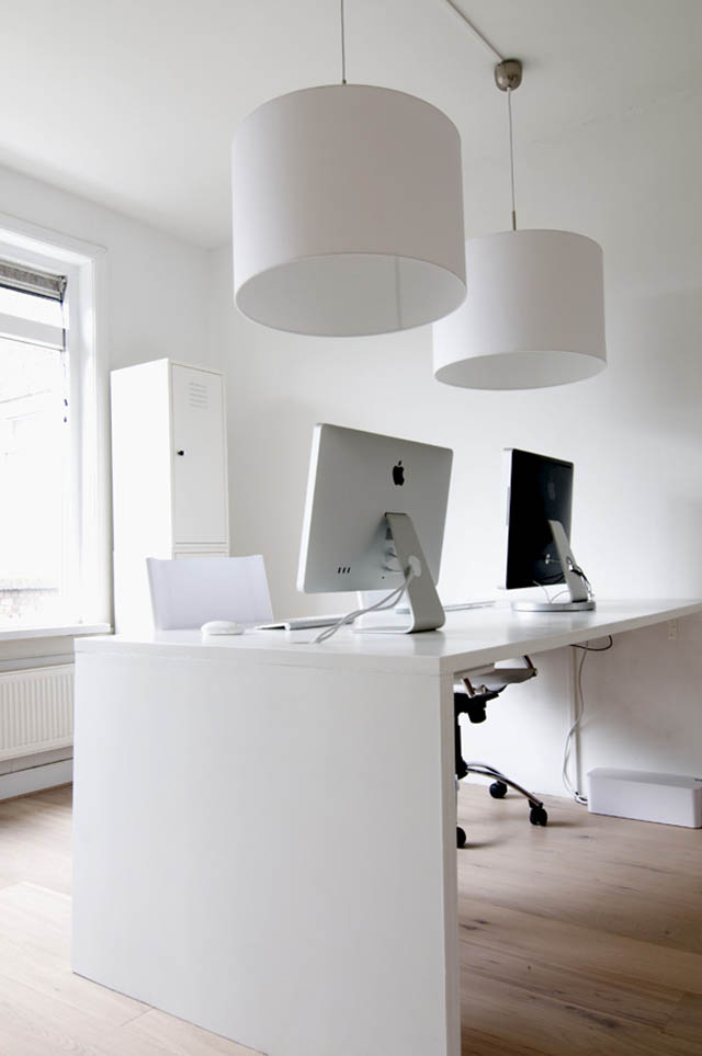
Yummygum is a design studio from Amsterdam that is all about tasty designs and refreshing ideas. They quote a minimalistic approach to life and their daily routine so it made sense to relay the concept to their office space.
Watch the Yummygum office setup montage
Our minimalist mindset continues in the interior design and design of our desk. We also tried to eliminate as much as possible and have used Blue Lounge CableBox plugs and sockets for tidy storage.


What about reflection from windows in sunny days? It will be awful.
Where should I start?
Like owning a Mac doesn’t make you a designer, minimal design is not about skipping the details.
One of those “details” was already mentioned by Sasha: bad monitor setup.
The doors they’re looking at break the optical peace that could have been achieved.
Storing work in boxes (shelf above of the doors) is somewhat… unprofessional, looking at the storage options available on the market today. Besides, those boxes underline the busy look the doors already cause.
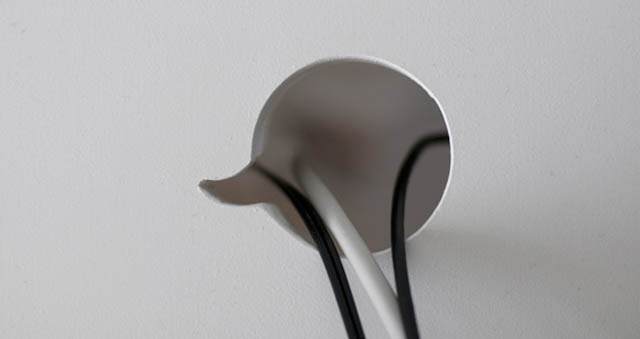
The worst from my point of view is that kitchen-sink piping that shows a rather ugly black spot in the middle of their wall. Would a bit more of that white paint have really hurt?
Last but not least, I see the ideas that went into the self-made “desk for two”… but I can also imagine the mess when that desk fills with active projects.
Don’t get me wrong: I recognize what they were trying to do. But I am sorry to say that I think they failed in the execution.
Minimalism isn’t about skipping the details, painting everything white and branding your self-made desk with your logo. Hell, I’ve seen offices using Swiss-design styling and they looked more minimal and cooler than that.
When I look at those photos again, all I see is that the “Yummygum” budget obviously was rather minimal. That would – at least – explain why they missed all the details of minimalism.
But I think I know what happened: the budget probably got invested in that Macbook Pro that is neatly hidden underneath that desk. ;)
Valid points Mike. Comes to remind me we need to get these threaded comments up and running!
Threads would be cool, but a different background color for your (admin) comments will probably be a good alternative too. You could go “peachy” using a contrasting color based on the blue-isch one we default comment-people have… something like #fef9f8. But that’s – of course – just me thinking loud. Feel free to ignore the idea.