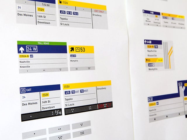
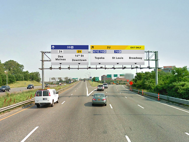
OK, lets for a second overlook the obvious flaws to this concept such as the huge cost associated with updating the entire interstate system, the fact that you shouldn’t be on your phone while driving, the assumption that technology will date at the same speed as the signs, and the well known fact that light-coloured text is easier to read on a dark background (especially at night). Phew. So all of that aside we rather like this attempt by San Francisco-based studio Manual to fix the “confusing, inconsistent and messy” situation that the current highway signs find themselves in. A bold attempt and not a terrible one at that. We think they look great, and could be implemented well, although impractical. Let us know what you think on twitter!

The tops of the signs are stripped with a band of color, corresponding to the type of roadway they represent–blue for interstate highways, white for U.S. highways, and black for state highways.


Manual dropped the green background in favor of gray and replaced the current system of shield symbols with simple square ones. The shields, they felt, were “dated and too ‘police state.'”


Iconography and visual style remains consistent across the signs and the proposed app.


