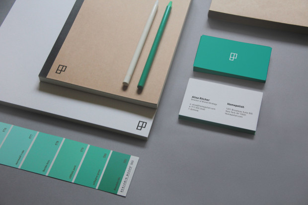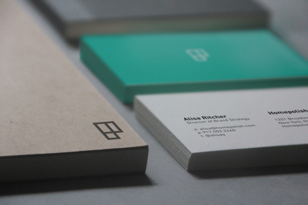
Leo Porto designed this rebranding for interior design company Homepolish. He wanted to focus on the approachable and affordable character of the company and differentiate them from the “high end” competition.
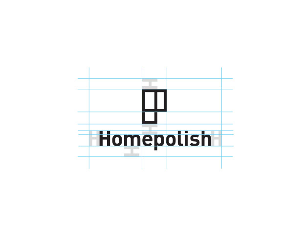
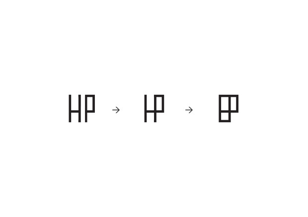
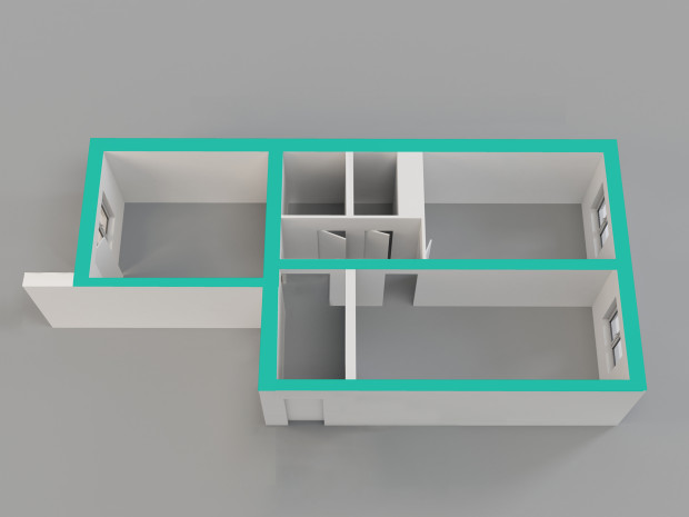
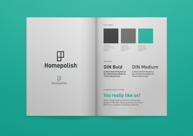
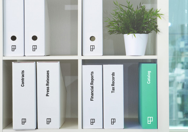
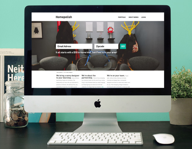
The mark is a geometric grid that outlines a simple office floorplan as well as portraying the H and P initials of the company. The simple but effective branding extends to all aspects of the company persona including office supplies and their online identity.