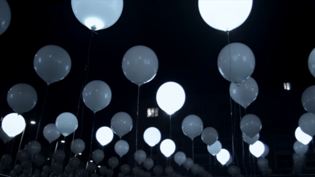
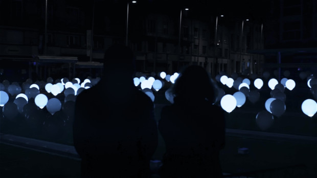
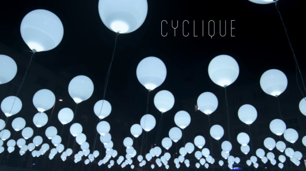
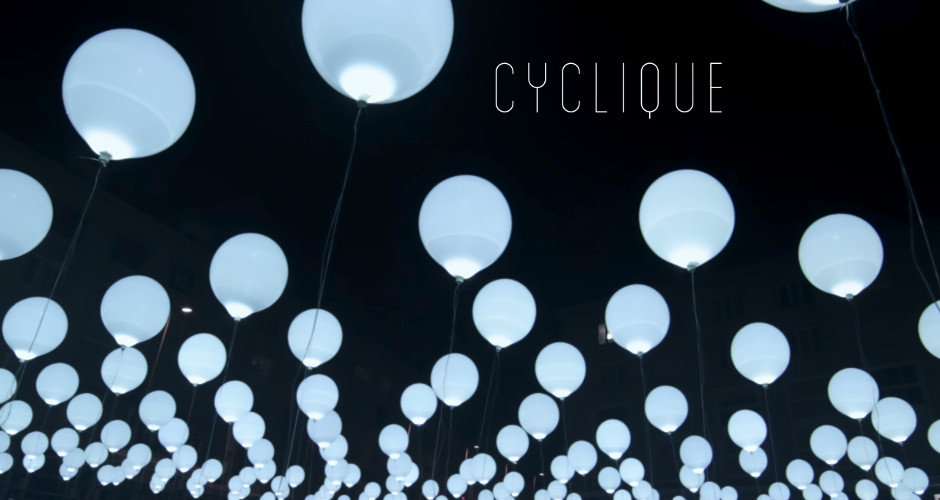
Blog

6 Effective Tips To Make A Responsive Website

Having a responsive web design is a must if you’re serious about optimizing the user experience and improving your Google rankings. The benefits of a responsive website design cannot be overstated. A responsive website will optimize a user’s browsing experience across all devices, boost your SEO efforts, and lower bounce rates.

At iBoost Web, we understand what it takes to create a responsive website. When you’re in need of SEO or website design in Atlanta, you can rely on our experts to meet and even exceed your expectations. In this article, we will provide you with six effective tips for designing responsive websites. 

  1. Adopt Fluid Grids

Instead of basing your website on pixel measurements, it’s advisable to opt for fluid grids in order to make sizing elements for different screens easier. Fluid grids size the elements of your website in proportion to the screen size it is displayed on, rather than making them one specific size.

  1. Pay Attention to Your Navigation

Your website’s navigation can make or break users’ experience. An outstanding web design leverages optimized navigation to have visitors spend more time on a website. Some of the effective ways to optimize your website’s navigation include:

  • Categorize your pages
  • Make all navigation elements clickable links
  • Add a search bar
  1. Take Touchscreens into Consideration

Most mobile phones and some laptops come with touchscreens. This makes it imperative for a responsive website to be designed in such a way that it is touch responsive. Ensure the buttons, calls to action, images, and other elements are large enough to let users tap.

  1. Optimize Typography

Typography refers to the creative design of the text on a webpage or screen. In other words, it determines how the words appear on your webpages. You should use typography in a way that makes your website look well-structured and professional.

Best Practices for Typography in Website Design

  • Use a highly legible font to improve readability
  • Limit the number of fonts in order to make your website look structured and professional.
  • Match and pair the fonts skillfully so that you can have a well-organized design.
  • Limit your line length to about 50 to 60 characters per line. This will make it easy for users to read your content.
  • Use the white spaces between lines correctly.
  1. Optimize Images for Mobile

Images and videos play an essential role in website design. Responsive images and videos help you increase your webpages’ loading speeds. Ensure you choose the right image file format, compress your images, include SEO-friendly alt tags, and optimize image delivery.

  1. Rely On a Professional Website Design Company

There’s no doubt that web design in Atlanta can be complicated for someone without the technical know-how, skills, and experience. Therefore, going the DIY route is never a good idea if you’re not a professional web developer. If you’re looking to build a responsive website, it’s best to work with a top-rated website development company in Atlanta.

Looking for Website Design Atlanta? Reach Out to iBoost Web

iBoost Web takes pride in offering reliable and budget-friendly website design in Atlanta, social media management, SEO in Atlanta, video marketing, PPC, online reputation management, and many other services.

Show More

Related Articles

Back to top button