Matthew Hollett has re-imagined the iconic American board game. In an attempted to simplify and clarify the game he has removed place names and other non-essential elements. The name is partly a reduction of the original and partly an homage to Oulipo, the “workshop for potential literature.”
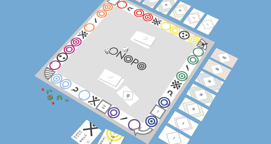
The visual echo between the three Os in the original game title and the groups of three spaces on the board inspired my design. The original game presented plenty of opportunity for distilling the design down to an iconographic system representing its basic mechanics.
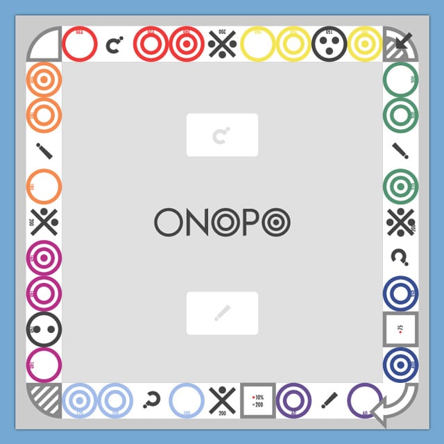
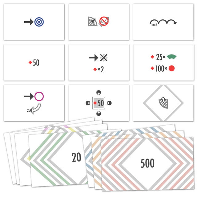
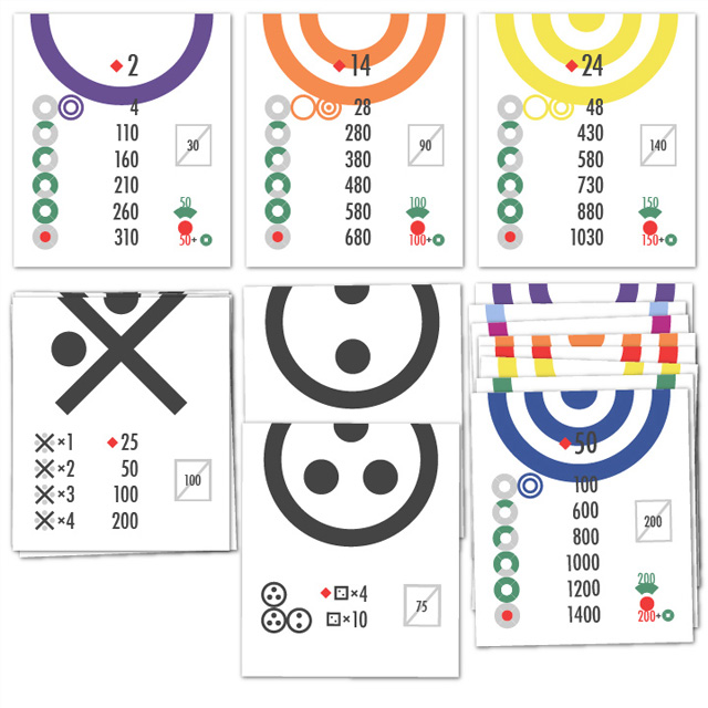
All text on the original cards has been translated into an iconographic system. The symbols for different types of spaces were designed so that each of these cards would have a bisected circle centered at the top.
The instructional cards were the most challenging part of the game to translate visually. One constraint I gave myself was to using the same size board, cards and bills as the original. I was thinking of the project as a re-skinning of the game rather than a complete redesign. Leaving certain remnants of the original also makes the project easier to understand at a glance.