This bunch of squiggly lines is the new logo of the Melbourn Squash Club. It looks like a little kid had a fun time with a black pen and a piece of paper, but it’s a masterpiece created by Distil Studio. While many sport clubs try to show the equipment or players of a sport in their logo, Distil Studio wanted to get away from all of that, to show the motion of the sport itself.
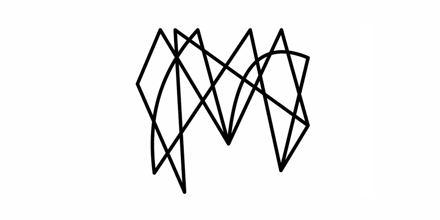
We kept much of the complexity of our first draft and opened up the spaces in-between to help visual clarity. The rebounds from the left and right provide a much stronger form. We also put in just a couple of curved sneaky drop shots to break up the rigidity of the lines.
The result is pitch perfect. Although the squiggly monogram contains a noticeable capital “M,” the design otherwise evokes the motion of a frantic game of racquetball, as two players race back and forth, yelling and smacking a ball upon a closed squash court. As the designers at Distil themselves aptly note, the finished design brings every thwack, thud, and squeak of the game to life.