Nobody ever said that keeping to the principles of minimalism was easy. As human beings, we have a tendency to build up clutter in almost everything that we do. We accumulate goods and clothes and leave them lying around the house. We hang on to objects for sentimental reasons long after we no longer have a practical purpose for them. Our email inboxes are overflowing with things we’ll never read again. Minimalism is a discipline that’s hard to keep to, and nowhere is it harder than in web design.
Designing a minimalist website is hard. Most websites want to tell and show their readers a lot of things in a limited amount of screen space. To catch the eye, web designers might employ multiple images, videos, and large-font headlines to draw clicks. Before you know it, your homepage is cluttered, and it becomes hard to know what to cull after you’ve already put it in place.
Even though it might seem counter-intuitive to purge huge amounts of content from a webpage to make it minimalist, we know it’s a tactic that works. We need only look at the success of slots casino UK websites to see that. The websites belong to an industry that makes billions of dollars each year, but you won’t find anything on them other than online slots. There are generally no videos and no distracting large images – just row upon row of online slots with virtually nothing in the way of accompanying text or distracting side-columns. The minimalist approach doesn’t stop the online slots websites making money, and it won’t stop your website from making money if you use the technique the right way either.
You probably want us to stop talking about how to do it and just get on with showing you how to do it – and so we shall!
Make Use Of Whitespace
The empty spaces on minimalist websites aren’t actually empty – they’re just whitespace, and whitespace serves an important function. It’s there to shift the focus of your reader away from what might otherwise be in the background and therefore keep it on the items and pieces of information that you want them to see and interact with.
Nobody will stick around to read a website where all the text and information is all clustered into one space, but when you spread that content out, you risk the reader drifting off between sections. Because whitespace is a void – an absence of content – the reader will automatically skip past it onto the next object without consciously processing it. They stay engaged without feeling overwhelmed, and that’s the whole point.
Make Fonts Count
The whole point of minimalism when it comes to web design is to steer clear of huge images and moving content. That doesn’t leave you with much to work with, and it makes text more important than ever. If the majority of the content on your page is text, the text has to be pleasing to look at. That makes your font selection absolutely crucial.
By this point, we all know which fonts to avoid. Comic Sans is a hard ‘no’ if you want your reader to take your seriously (although some anecdotal evidence suggests that it’s now entered the category of ‘so bad it’s good’), so pick something crisp, clean, and professional. Sans serif fonts rarely disappoint on this front because they’re easy on the eye, and they scale well on mobile screens, but you might want to vary this choice depending on the industry you operate in. Use different fonts for your headlines and the main body of your text if you want to shake things up a little.
Remove All Sidebars
A list of options and headings scrolling down the side of a page will distract the focus of your reader away from the bulk of your content. They’ll be thinking about what – if anything – they might want to click on next, rather than what you want them to be reading right now. The same goes for menu options scrolling across the top of your page.
The best place to put all of your menus is in a top corner of your website, all contained within a single button. You might even want to consider using your business logo as the button. When it’s clicked on, all of the necessary navigation options can appear as a dropdown. It’s a cleaner way of arranging menus, and it also makes for an easy website template.
Use Warm Colors
Despite its name, whitespace doesn’t have to be white. It can be any color you like so long as it doesn’t aggravate the eyes of your readers. Your industry almost certainly has a color associated with it. An environmental website would be green, for example. Technology websites tend to be blue. Do some research on your competitors’ websites and see what colors they’re working with to give yourself a steer on this if you need to.
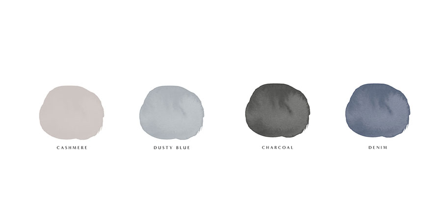
The color you choose should be warm and inviting without being aggressive or loud. Pinks and yellows are particularly welcoming. If you’re going to use color, remember that all your text should be black. There are certain combinations of font color and background color that are unfriendly on the eyes. If we never see a red and blue website again, it will be too soon.
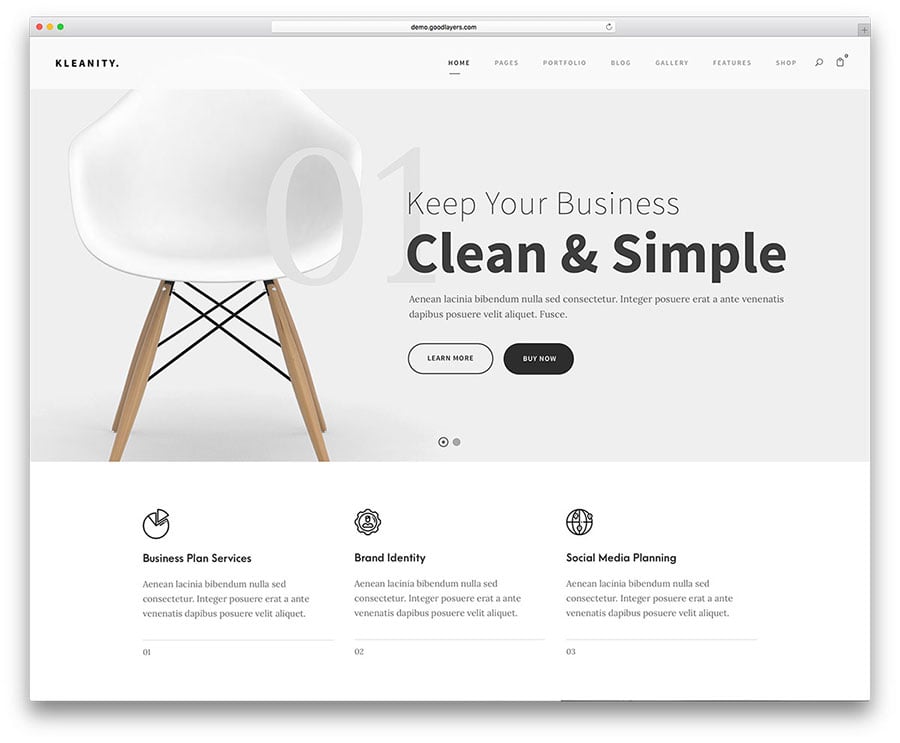
Use One Powerful Image
The idea that minimalist website design means doing away with images altogether is a misconception. Visual content is an important part of webpage design, and it always will be. Pictures play their part in making any design attractive – but if you’re going for the minimalist approach, it should be one image, not several.
Whatever the message you’re trying to get across on your website might be, pick just one photograph or another image that sums it up. You can use it either as a header, or a subtle background image so long as it’s appropriately faded and doesn’t make the text hard to read or focus on. Not only do multiple pictures increase the loading time of your website, but they also result in your readers scrolling from one picture to the next without reading the text between them. One picture is enough if it’s the right picture – so choose wisely.
If you follow these five principles, you should find that you can consistently build minimalist websites quickly and easily. It makes your work as a web designer easier to carry out – and might even mean you can move from one project to the next faster than you could in the past! Minimalism is all about getting the maximum output from minimal input, and a minimalist website is the way to do that for your company webpage.