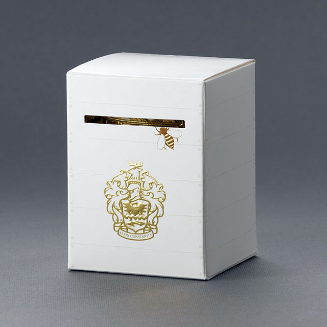
While on one of my infamous wine tasting trips to the farm near my mothers house (Klein Constantia) I noticed some absolutely beautiful packaging for a honey appropriately labeled “the Bees Knees”. It really is too rad and I am completely in love with it!
The small white box resembles a bee have box with embossed ridges to denote planks of wood & nails. The famous Klein Constantia crest is gold foiled on the front of the box below the diecut slit that has one bee on its way into the box inviting you to open the packaging. The box opens to reveal a, bee covered, honey comb pattern as well as small diecut bees packaged inside each box. all the bees were also detailed with gold foiling.


One word to start with: gorgeous.
It looks so simple and obvious, yet it’s full of details. This piece is closing in to a kind of perfection that I haven’t seen in package design for a long time. Thanks for finding, capturing and sharing this beauty.
It’s fascinating what you’re able find when going for a sip of wine. By the way: if you haven’t been checking it out yet… I’ve heard positive rumors about good wine coming from Anwilka in the Helderberg, Stellenbosch too. ;)
Thanks for your comment Mike, I will definitely check out Anwilka next time I go tasting in Stellies!